Unique pages designed and built
Brand archetypes identified
Buyer journey stages defined

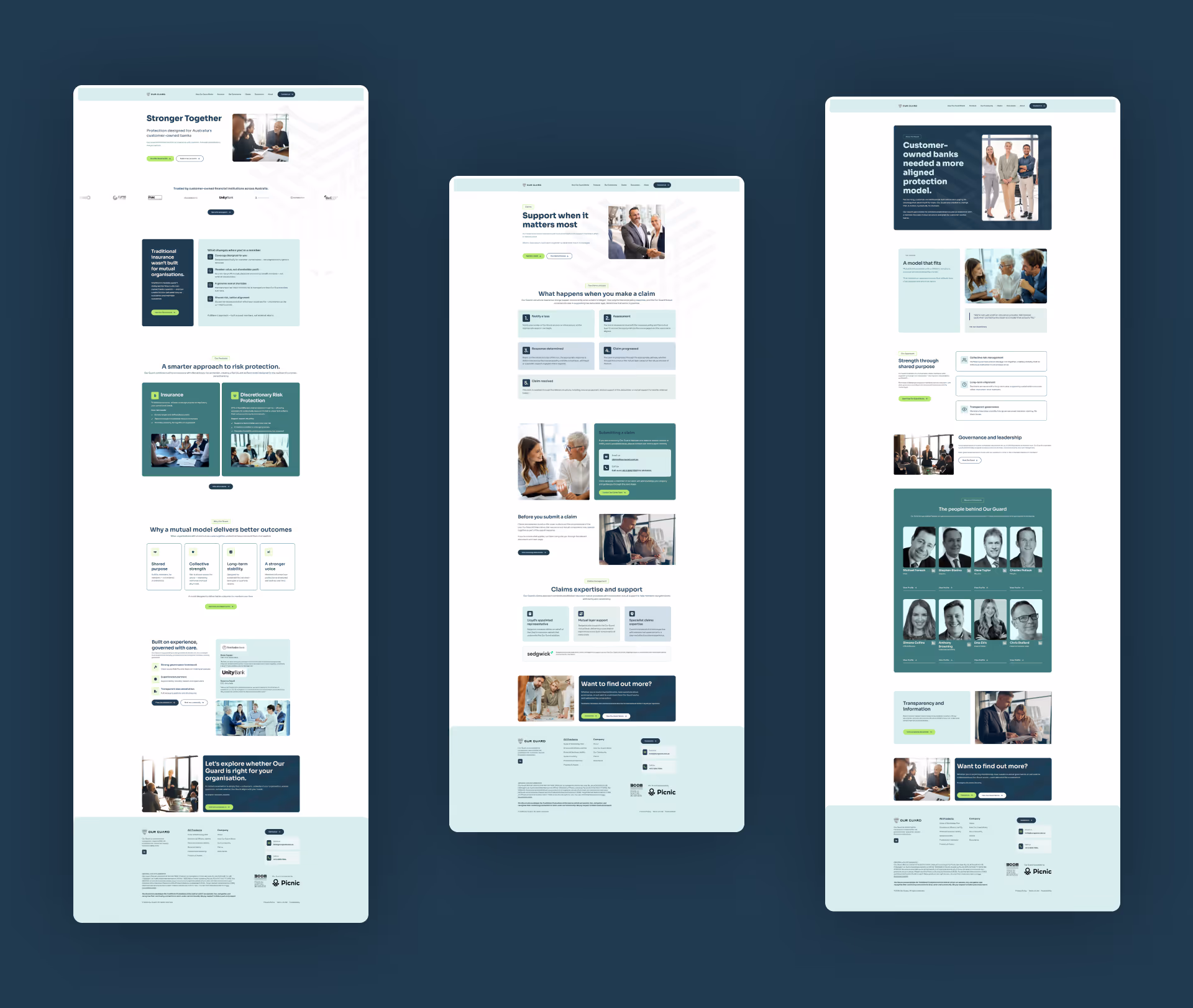
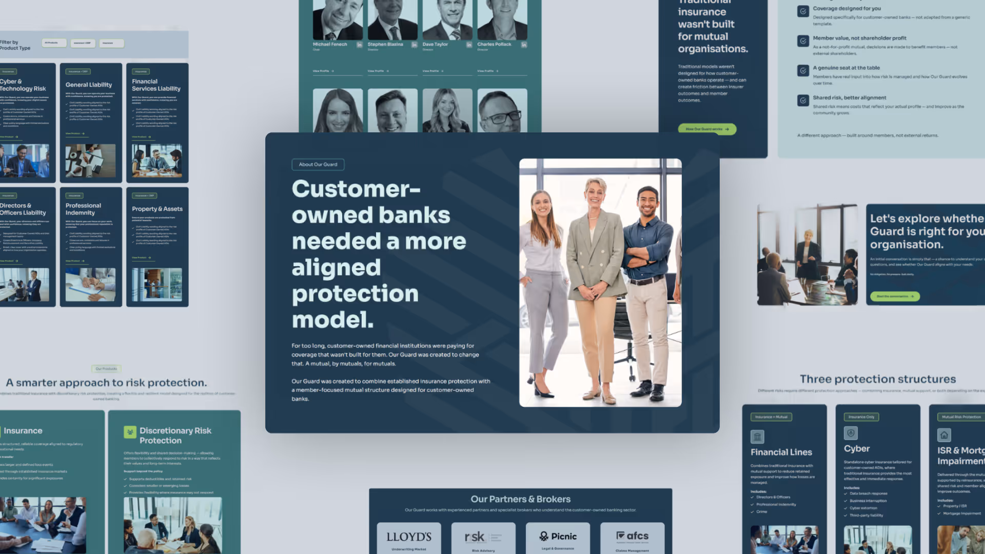
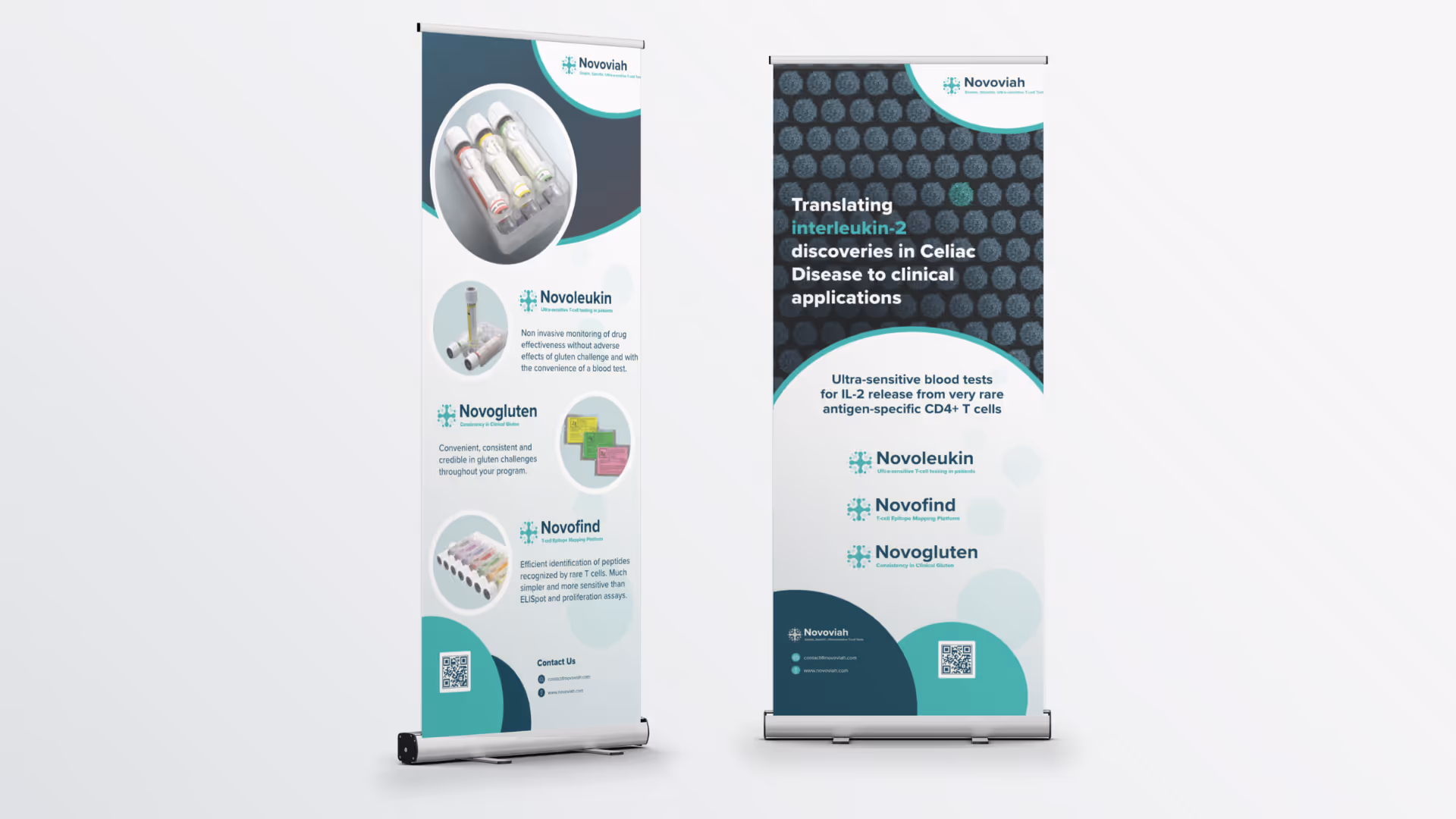
Our Guard is a member owned mutual that provides risk protection specifically for financial institutions that are customer owned, including community banks, credit unions, and ADIs. Their model is fundamentally different from traditional insurance: no shareholder profits, tailored products, and a community of like institutions sharing risk together. For the organisations they serve, it is a meaningfully better alternative.
The website needed to reflect that difference clearly. Our Guard's audience, CEOs, CFOs, CROs, and the brokers who refer them, arrive through warm referrals rather than search. By the time someone lands on the site, they already know the name. The website's job is not to sell. It is to confirm, clarify, and remove friction from a decision already in motion.
In a referral-driven category, the website does not start the conversation. It is where the decision gets confirmed or quietly abandoned.
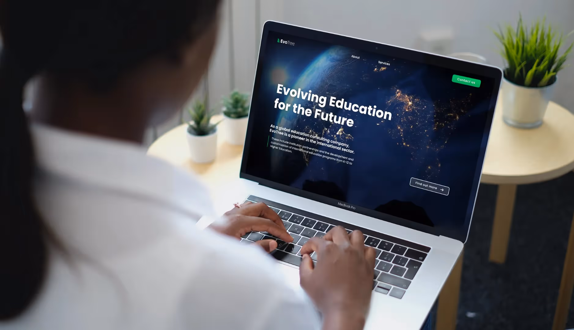
The discovery workshop gave us a rich picture of Sharesource's competitive position, target audience, and growth ambitions. Across the offshoring category, providers had converged on a similar look and feel, giving Sharesource a clear opportunity to step out of that visual pattern and build something that felt distinctly their own. In working through the user experience, it became clear that talented professionals from Sharesource's global talent hubs who were actively seeking opportunities needed a more defined path through the site, an audience worth designing for intentionally alongside the business-facing content. Sharesource's BCorp certification and ethical off shoring positioning are genuinely powerful differentiators, but their target audience, typically time-poor CTOs, CEOs and engineering leads, evaluate offshoring partners on capability first. Finally, Sharesource had accumulated impressive evidence of their capability, but giving this content its own dedicated structure would make it significantly easier for prospects to find and act on.
For time-poor decision-makers, trust and capability come before values.
Leading with what Sharesource can do, then reinforcing it with why they do it, is what makes the ethics story land.
We ran Our Guard through our Brander Brand Persona tool, a structured survey process that surfaces brand archetypes, colour direction, shape language, typography guidance, and tone of voice from the responses of the people who know the brand best. The outputs gave us a data driven design brief: blues and purples for trust and innovation, structured rectangular forms softened with circular elements for community, a sans serif typographic system for modern accessibility, and a tone of voice, Trusted Authority with Approachable Clarity, that balanced financial expertise with the warmth of a member owned model. Every visual decision that followed was grounded in that brief rather than subjective preference.
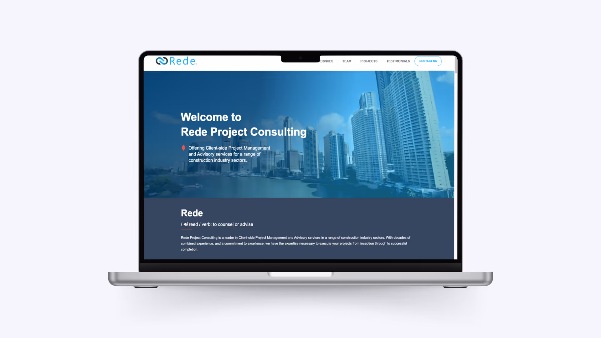
With a clear brand direction in place, we mapped how Our Guard's two audiences actually move through a decision. The result was a four stage buyer journey, orient, differentiate, reassure, convert, built into every page. The homepage answers one question fast: is this for organisations like mine? The How It Works section explains the mutual model in plain language. The Documents section, About page, and FAQ structure answer the governance and credibility questions a board will ask. The contact page and CTA are positioned as a low pressure next step rather than a hard sell.
The Webflow build spans 10 pages and 11 dynamic CMS collections covering products, blog and news, documents, FAQs, testimonials, team, community members, partners, brokers, legal content, and product categories. The Our Guard team can add products, update compliance documents, and publish content without developer support. The build follows LimeHub's Client First naming conventions with a fully systematised component library. A recorded training session was delivered at handover.
A complete, CMS driven Webflow site the Our Guard team manages independently.
Everyman, Sage, and Outlaw translated from Brander outputs into a consistent visual and content system.
Every page has a defined role in moving a warm referral toward a confident next step.
For Our Guard, the measure of success is about the quality of the conversation that follows a website visit. A site that reflects the model accurately, speaks to the right audience in the right register, and removes every remaining reason to hesitate gives that conversation the best possible start.


.avif)

.avif)
.avif)
.avif)

.avif)

.avif)

.avif)

Schedule a discovery call to discuss your current challenges and explore how a strategic approach can drive growth.

