


Over time, the brand had evolved organically rather than strategically. Different assets, created at different points by different hands, had gradually diverged in colour, typography, and design language. For a company operating in industries where precision and reliability are everything, visual inconsistency creates a subtle but real disconnect, between what the business delivers and how it presents itself.
The expertise was never in question. The brand needed to tell it.
In the first week of the engagement, we ran a discovery workshop and stakeholder research. A pattern emerged quickly. NVMS had evolved significantly over 35 years, expanding into new solution categories and serving increasingly sophisticated clients. The brand hadn't kept pace with that growth. It was communicating a version of the business that no longer existed.
The gap wasn't purely aesthetic. NVMS's clients are engineers, operations managers, and site leaders making high-stakes decisions about asset protection and operational safety. They evaluate vendors on credibility and precision. For a business built on technical rigour, a visual identity that felt inconsistent created a subtle but meaningful disconnect between what NVMS delivered and how they were perceived.
NVMS's clients hold their vendors to the same standard they apply to their own operations. The brand needed to communicate the same level of precision as the monitoring solutions themselves.
We began with a structured brand profiling process, gathering input from stakeholders across the business to understand how NVMS was perceived by clients, partners, and internal teams. This gave us an evidence-based foundation for every design decision that followed, rather than relying on assumptions about what the brand should look like.
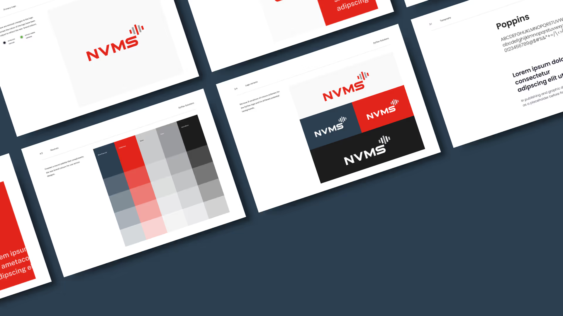
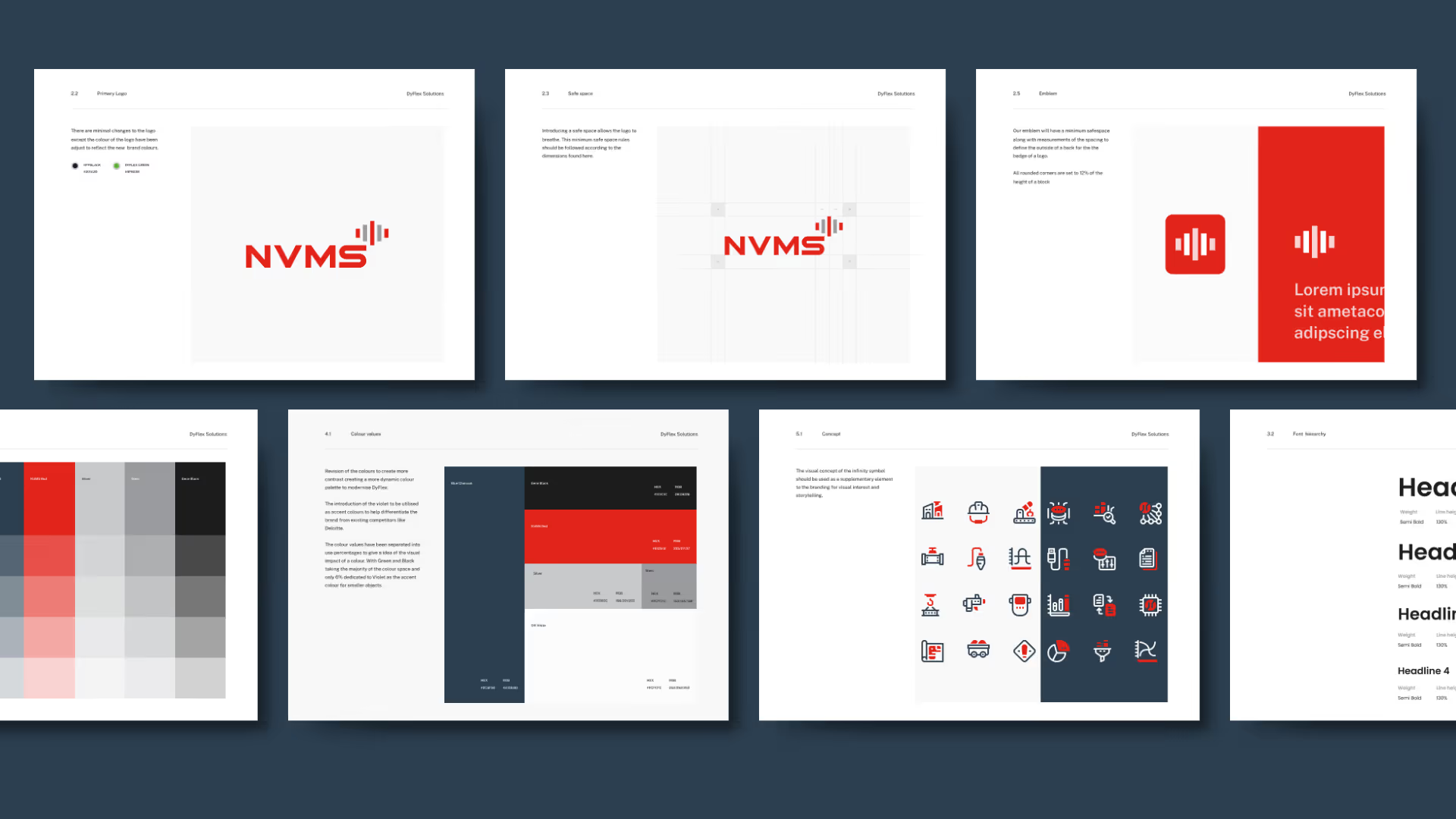
The most visible change was the introduction of a bold new blue alongside NVMS's existing red, white, and grey. The new colour added depth and modernity to the palette while maintaining the warmth and familiarity of the legacy identity. Typography was updated to a clean, modern sans-serif that communicates clarity and professionalism across both digital interfaces and printed technical documentation.
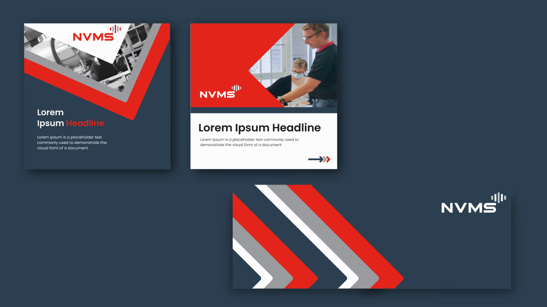
We developed a complete set of brand guidelines designed to be practical, not just beautiful. Logos, typography, colour systems, and design principles were standardised and documented so that both internal teams and external partners could apply the brand consistently across every touchpoint: from website and presentations to product packaging and signage. The guidelines were designed with the website rebuild in mind, ensuring the brand refresh would translate directly into the digital experience.
A refreshed visual identity that communicates the precision and credibility NVMS has earned over three decades
Colour palette, typography, and design principles standardised across all touchpoints
Brand refresh completed within the first 5 weeks, feeding directly into the website rebuild that followed
The refresh gave NVMS a visual identity that matches the calibre of their work. For a business that operates in industries where precision, reliability, and trust are non-negotiable, every touchpoint now communicates those values consistently. And because the brand refresh was designed from the start as the foundation for an immediate website rebuild, there was no gap between the new identity and its digital expression. The two projects were delivered as one integrated engagement, completed within three months.


.avif)





Schedule a discovery call to discuss your current challenges and explore how a strategic approach can drive growth.




