


Keldy was founded by Kellie to help new entrepreneurs and sole traders navigate the real complexities of starting and scaling a business. The service is built on relationships, bespoke strategic advice, and genuine one-on-one mentorship, the kind of support that makes a meaningful difference in the early stages of building a business.
That personal quality was both the brand's greatest strength and its central creative challenge. The identity needed to feel like Kellie who is approachable, warm, and trustworthy all while standing firmly on its own as an independent business brand. It also needed to be flexible enough to grow. With potential future services and sub-brands on the horizon, a brand that couldn't scale would quickly become a constraint.
A mentorship brand that feels too corporate loses the human connection that makes it valuable. One that feels too personal risks being dismissed before the conversation starts.
The business mentorship and consulting space is crowded, and much of it looks the same. Navy blues, formal typography, and safe geometric marks dominate a category that is, at its core, about human relationships and individual growth. Keldy had a genuine opportunity to stand apart — not by being louder, but by being distinctly more human.
What also became clear through the Brander process was that Keldy's identity needed to carry multiple layers simultaneously. It needed to reflect Kellie's personal approach without making the business feel like a one-person show. It needed to feel energetic and optimistic without sacrificing the credibility that business owners expect from an advisory service. And it needed room to grow as Keldy's service offering expanded over time.
The brand needed to resolve the tension between personal and professional, warm enough to attract first-time entrepreneurs, credible enough to be taken seriously by established business owners.
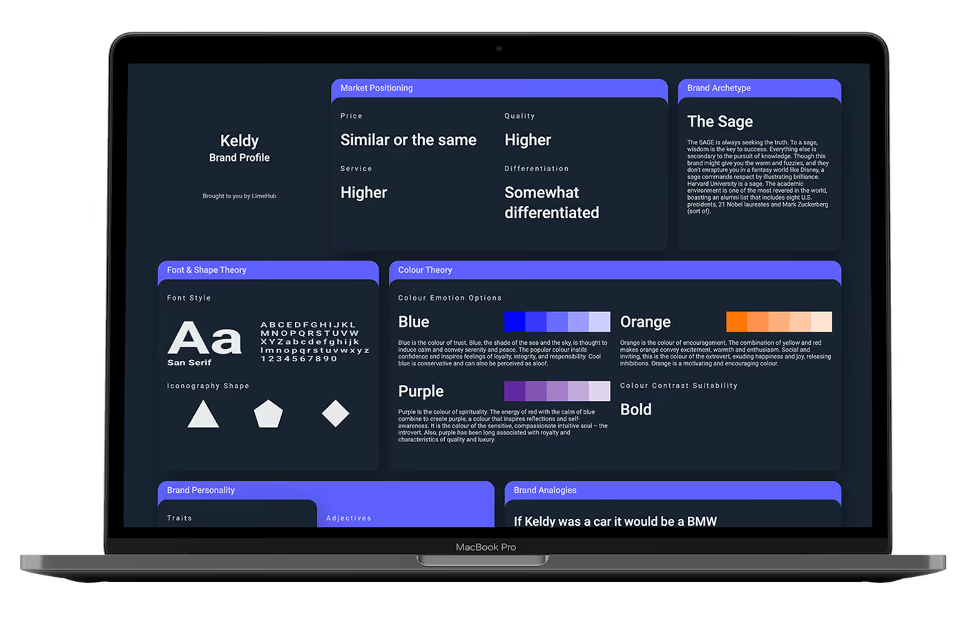
Kellie worked through Brander, LimeHub's proprietary brand development platform, to map Keldy's positioning, values, tone, and aesthetic preferences through a structured, data-driven process. Rather than relying on subjective creative rounds, Brander produced a validated brand profile that reflected both Kellie's personal approach and Keldy's market positioning. The result was a clear creative brief grounded in evidence, giving every design decision that followed a strategic reason to exist.
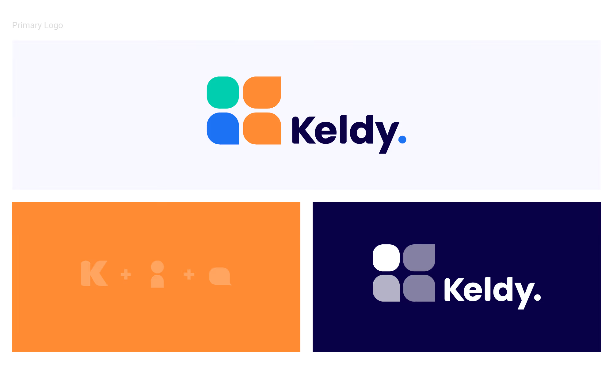
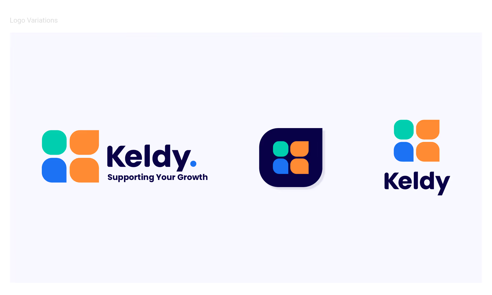
The Keldy logomark is built from three elements combined into four rounded shapes: the letter K, a person, and a speech bubble. Together they communicate exactly what Keldy does — a founder-led service built on human connection, conversation, and strategic guidance. The rounded forms keep the mark approachable and warm, while the Midnight wordmark and the bold full stop give it the authority a serious advisory business needs. The construction is immediately recognisable as a cohesive icon while rewarding closer attention.
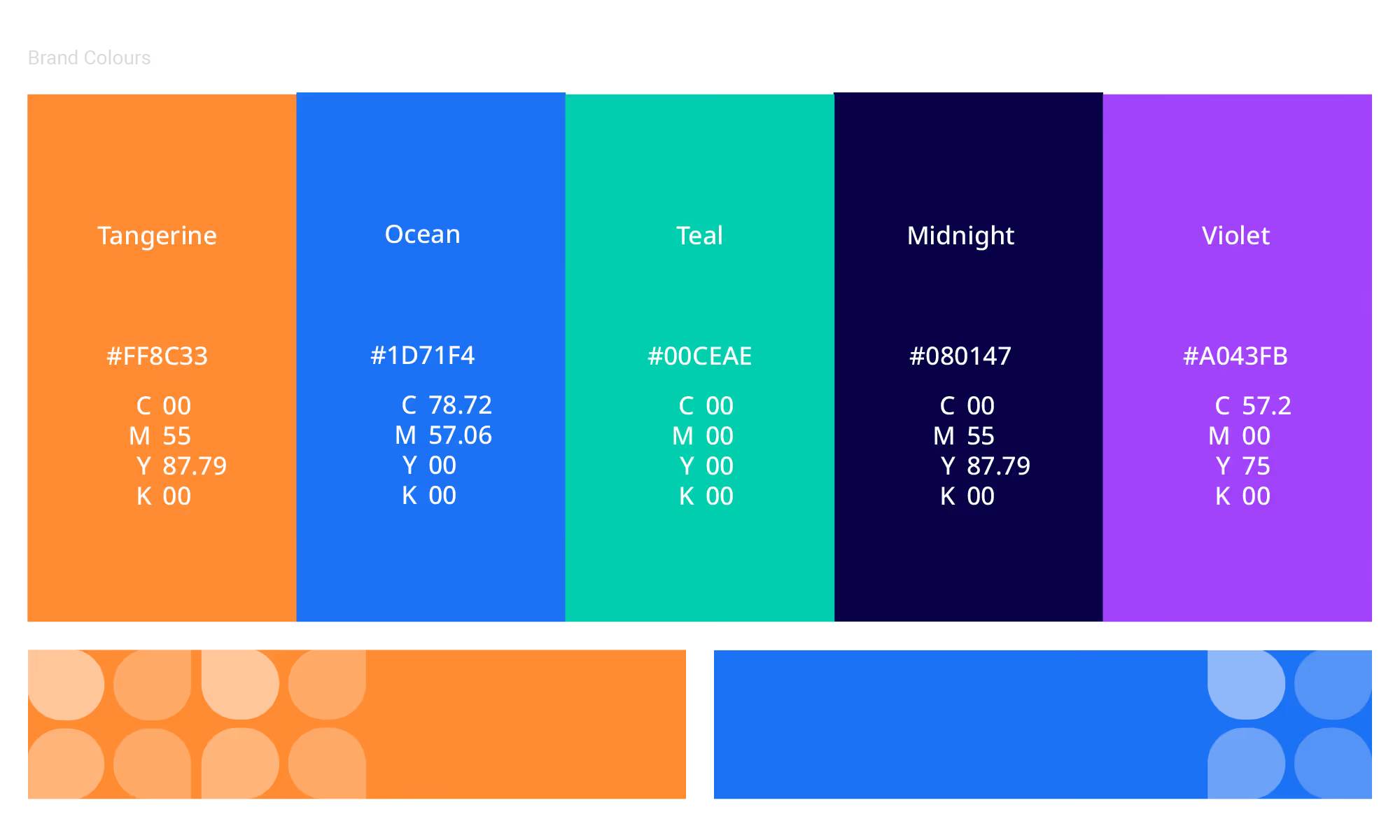
Five brand colours were developed: Tangerine, Ocean, Teal, Midnight, and Violet. The palette is deliberately wide, giving the brand the flexibility to express different tones across different contexts — energetic and optimistic in marketing, calm and authoritative in more formal settings. That range also makes the system genuinely useful for future sub-brands, which can draw from the palette without needing to introduce new colours. Brand guidelines were delivered alongside the identity to ensure visual consistency across every application.
K, person, and speech bubble combined into a single mark that communicates mentorship, connection, and guidance before a word is read
A vibrant five-colour system that gives the brand expressive range today and a clear framework for sub-brands tomorrow
Brand guidelines ensure Keldy's identity stays cohesive across every digital and print application as the business grows
Keldy launched with a brand that reflects the personal, strategic, and growth-focused nature of its service, one that feels genuinely different from the consulting brands around it. The scalable framework means that as Keldy's offering expands, the identity is ready to grow with it rather than hold it back.






.avif)


Schedule a discovery call to discuss your current challenges and explore how a strategic approach can drive growth.




