A logomark with layered meaning
Founders aligned in days, not weeks
Brand built for digital from the start

Rede Project Consulting was founded by two senior professionals who had worked together for years before deciding to launch their own firm. They chose to build the business during the Covid-19 pandemic, and rather than waiting for conditions to settle, they committed to developing a compelling brand and website upfront so they could move quickly when the moment came.
The brief was clear in ambition but complex in execution. The founders had differing design preferences and previous logo attempts had failed to capture what the business actually stood for. In a saturated consulting market, a generic mark was not an option. The brand needed to carry genuine strategic meaning, reflect the founders' values, and position Rede credibly against established competitors from day one.
Critically, the scope included a website from the outset. That meant every brand decision needed to work not just in isolation, but as a foundation for a full digital presence.
Critically, the scope included a website from the outset. That meant every brand decision needed to work not just in isolation, but as a foundation for a full digital presence.
The core tension in the brief was subjectivity. With two founders who had clear but different instincts about what the brand should look and feel like, traditional design rounds risked becoming a negotiation rather than a strategic process. What was needed was a way to move both founders toward a shared position based on evidence rather than preference.
Beyond that, the competitive landscape reinforced the need for differentiation. Project consulting is a crowded space, and most brands in it default to corporate conventions: navy, sharp geometry, safe typography. Rede's point of difference was the depth of personal involvement the founders brought to every engagement, and the brand needed to communicate that without sacrificing the credibility that enterprise clients expect.
The brand had to resolve a genuine internal disagreement and deliver a result that felt personally meaningful to both founders while positioning Rede distinctly in a competitive market.
Rather than opening with mood boards or concept presentations, we ran the founders through Brander, LimeHub's proprietary brand development platform. Brander mapped their responses to structured strategic prompts, identifying their shared positioning, values, and aesthetic preferences through a data-driven process rather than a subjective one. The result was a clearly defined brand territory that both founders recognised as their own, reached in days rather than weeks.
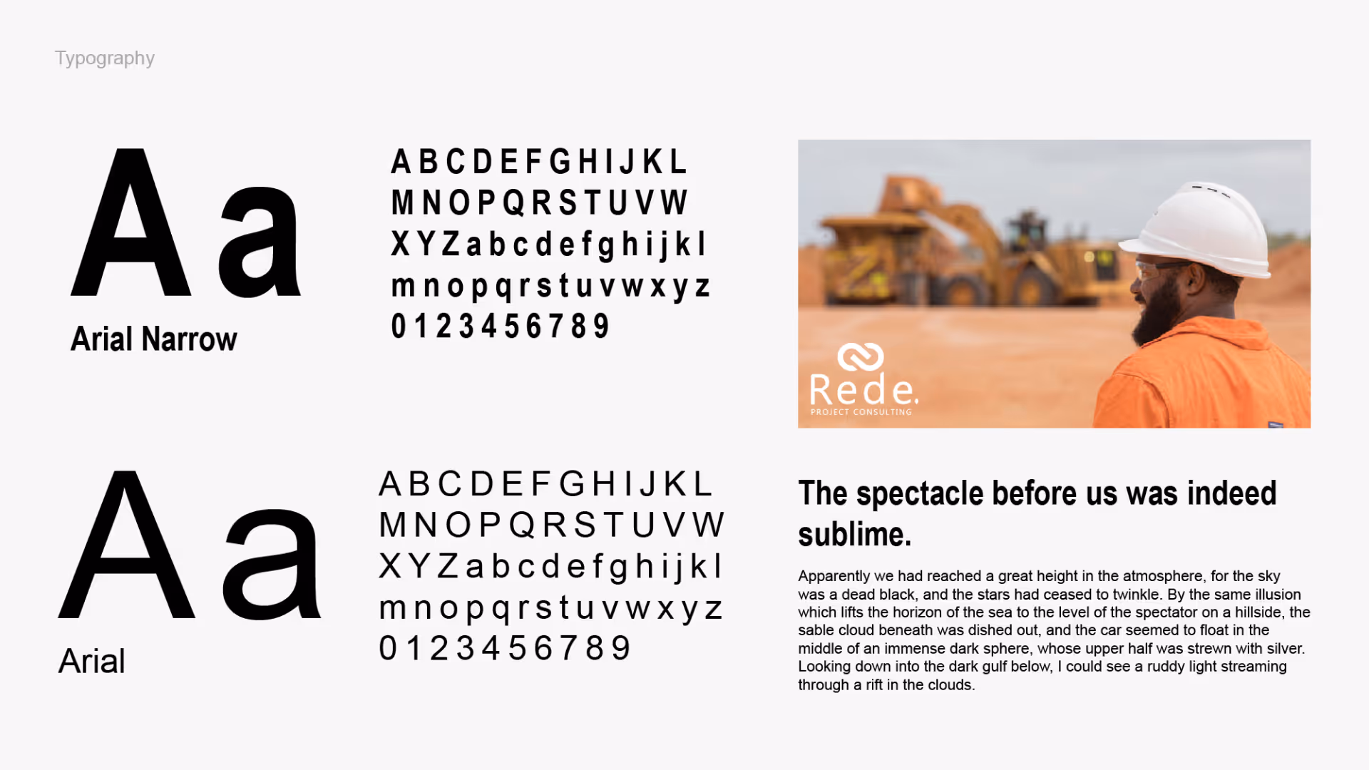
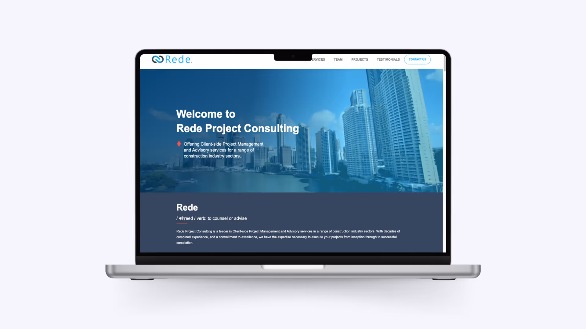
With a clear strategic foundation in place, we developed a logomark built around a stylised infinity symbol. The two interlocking forms represent the coming together of the founders and the collaborative partnership Rede brings to client engagements. The custom wordmark uses subtle rounding on the R, e, and d to balance strength with approachability, striking a tone that works for both corporate and community-facing clients. The full stop at the end of "Rede." functions as a project milestone, a detail that will resonate immediately with anyone who has spent time in project planning and reporting. The Cinnabar red used for the milestone draws the eye without overpowering the mark.
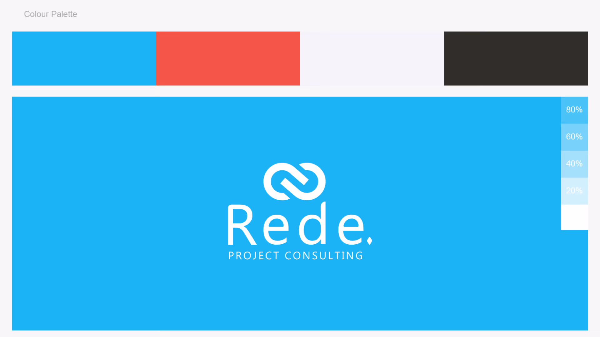
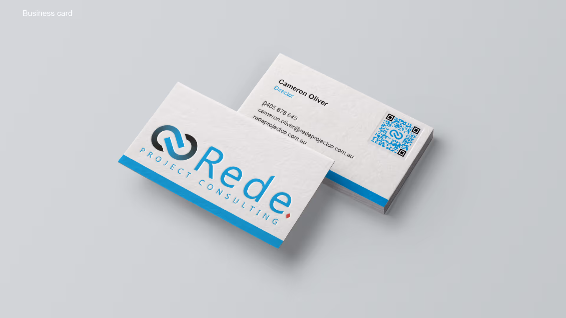
Knowing the website was in scope from the start shaped every decision in the identity system. Sky blue as the primary brand colour is vibrant and confident without being aggressive, working equally well as a full-bleed digital background and as a single colour on white. The dark charcoal secondary and Cinnabar accent give the system enough range to handle the full variety of contexts a website demands. Multiple logo formats were delivered alongside the brand identity, including horizontal and vertical lockups, a standalone icon, and a rounded square app icon. Business card design was completed as part of the same engagement.
Collaboration, continuity, and project milestones built into a single mark that communicates what Rede stands for before a word is read
Brander resolved a genuine internal design challenge, delivering a brand both founders could own and present with confidence
Lockups, icon formats, colour system, and business cards delivered as a cohesive system ready for the website build that followed
Rede launched with a brand that positioned them credibly against established players in the project consulting space, without looking or feeling like every other firm in the market. The infinity logomark gives the business a distinctive and memorable visual anchor. The brand system built around it had the range to support the website we delivered, business collateral, and whatever comes next as the firm grows.


.avif)
.avif)
.avif)
.avif)

.avif)

.avif)

.avif)
Schedule a discovery call to discuss your current challenges and explore how a strategic approach can drive growth.

