

.avif)
The Australian Shoulder Fellowship is an AOA-accredited one-year surgical training program led by Dr Kenneth Cutbush and Dr Ashish Gupta under the Australian Shoulder Research Institute. It accepts three fellows annually, training them in advanced arthroscopic shoulder surgery and arthroplasty across Brisbane's leading private hospitals, with a mandatory research component published during the fellowship year.
The fellowship had built a strong reputation among the international orthopaedic community over many years. A visual identity that could carry that standing and communicate the warmth, community, and distinctive Brisbane lifestyle that set it apart from other elite programs, was the next step.
The engagement was structured across two phases. The brand identity came first, designed from the outset to scale directly into the Webflow website that would follow.
Elite in the operating theatre, genuinely warm outside it. The brand had to hold both.
The discovery workshop surfaced a clear positioning: the Australian Shoulder Fellowship differentiates not on clinical prestige alone (which it has in abundance) but on the personal connections and genuine community it builds around its fellows. Competitors led with authority. This fellowship led with belonging.
That positioning had direct implications for the visual identity. A palette of clinical blues and greens would signal competence but blend in. The brand needed to communicate warmth, dynamism, and a sense of place without sacrificing the authority that an elite surgical audience would expect.
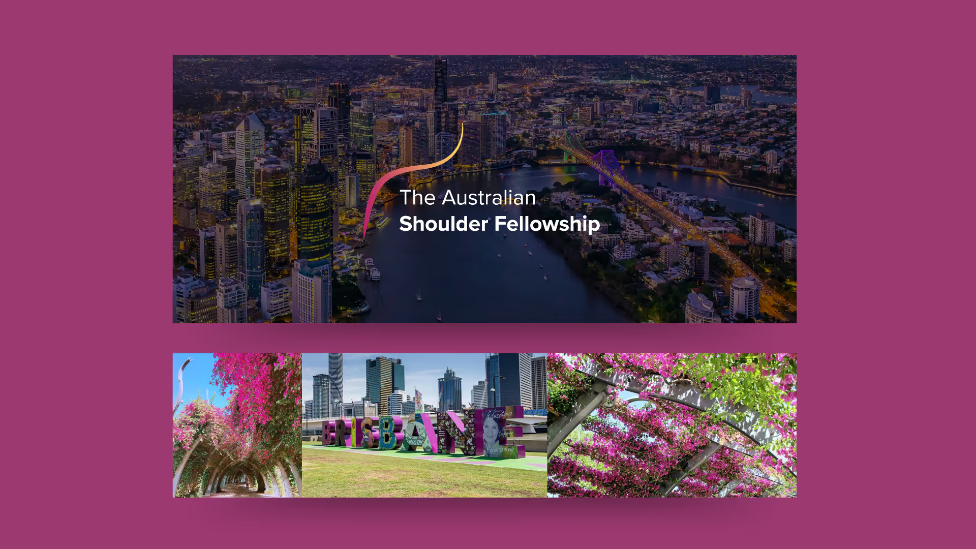
Brisbane itself emerged as a key design asset. The subtropical climate, the distinctive flora, the lifestyle; these are genuine drawcards for international applicants weighing their options, and the brand needed to carry that story visually.
A fellowship competing for international candidates needs to sell more than a surgical curriculum. The brand had to sell Brisbane, community, and belonging as clearly as it sold clinical excellence.
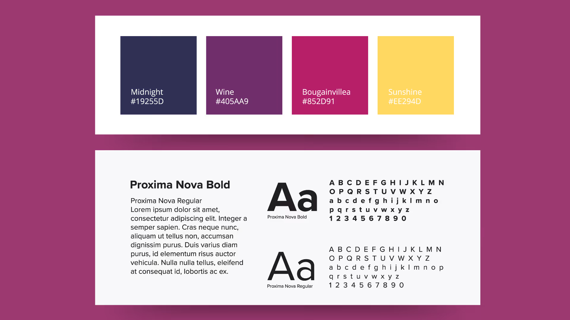
The colour palette was the central design decision. Midnight, a deep navy, provides the authority and gravitas the audience expects. Bougainvillea, a bold magenta named after Brisbane's iconic flowering plant, and Sunshine, a warm gold, pull the identity firmly away from clinical convention. These are colours that signal warmth, energy, and a distinctive sense of place. The colour names themselves tell the Brisbane story without needing a word of copy.
The fluid swirl above the wordmark does multiple things at once. It references the curved anatomy of the shoulder without being literal about it. It communicates movement and precision, relevant to an arthroscopic surgical context. Its organic, flowing quality signals the approachable and human character of the program. The gradient moves through the brand palette, giving it energy and warmth. It is the opposite of a rigid geometric medical emblem. Proxima Nova Bold and Regular provide a clean, modern typographic foundation that works at every scale.
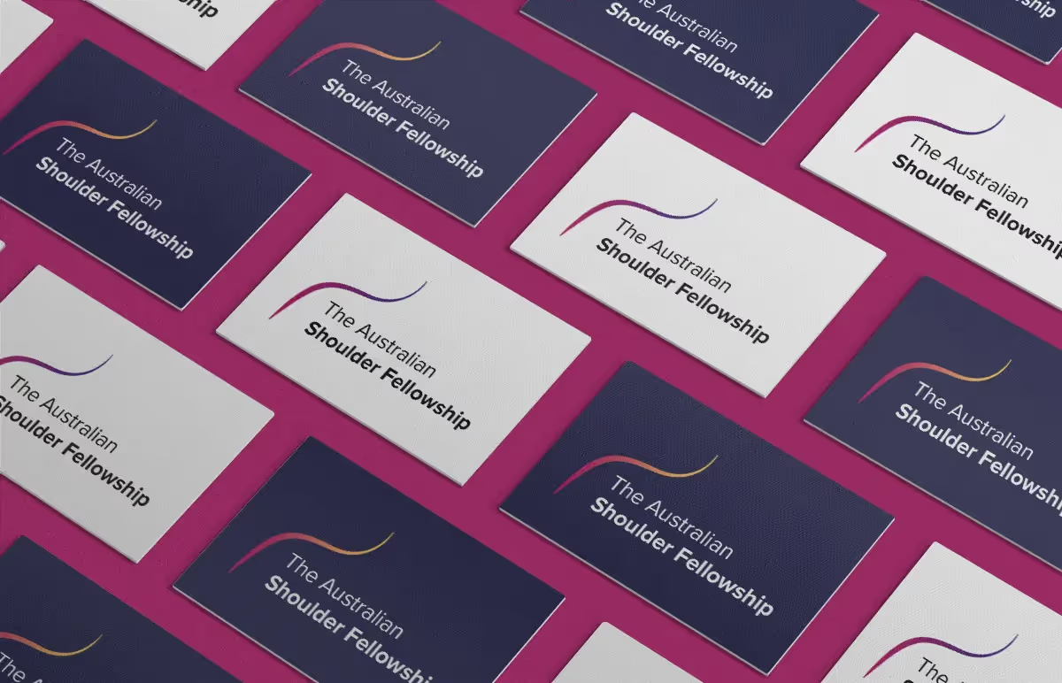
The brand was delivered with multiple logo lockups, horizontal and stacked, on light and dark backgrounds to ensure consistency across every context the fellowship operates in. Conference presentations, printed materials, event signage. But a Webflow website was already scoped as Phase 2 of the engagement, and the brand system was built with that in mind from the outset. Colour variables, typographic scales, and component-level design decisions were made with the web build in sight. When the Webflow build began, there was no gap between what the brand promised and what the site could deliver. The two phases were designed to be continuous, not consecutive.
A warm, dynamic identity that competes for international attention without defaulting to clinical convention
A palette that communicates place and personality as clearly as it communicates surgical authority
Every lockup the fellowship needs, designed to work consistently from conference signage to the Webflow website
The brand gave the Australian Shoulder Fellowship a visual identity that could carry the full weight of its positioning: a blue ribbon program that competes globally on surgical excellence and wins personally through community and belonging. That identity fed directly into the Webflow website build in Phase 2 with no design translation required between what the brand promised and what the digital experience delivered.



.avif)





Schedule a discovery call to discuss your current challenges and explore how a strategic approach can drive growth.




