Distinct sub-brand identity
Tech + community positioning
Brand system for growth

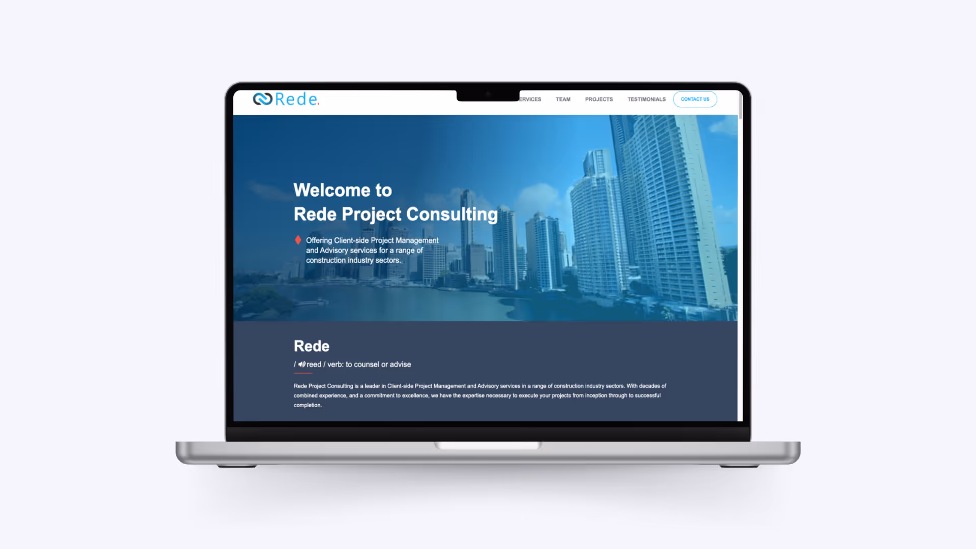
Sport Access HQ is a digital platform that helps sporting clubs and facilities audit their accessibility and inclusivity, identify barriers, and track improvements over time. It gives peak sporting bodies the data they need to inform inclusion strategy at a systemic level. The platform sits under Inclusive Sport Design, a leading advocate for making sport more accessible for people with disability.
SA HQ needed its own brand identity. It was a technology product with a distinct audience: facility managers, club administrators, and sporting peak bodies. But it also had to remain connected to ISD's existing brand equity and the mission that drove it. The challenge was designing something that felt like a modern tech platform while communicating warmth, community, and the belief that access to sport is a right, not a privilege.
Getting that balance wrong in either direction could have undermined the product. Too corporate and it would feel disconnected from the inclusion mission. Too community-focused and it may not be taken seriously as a technology platform.
The platform needed to feel like software built with purpose -- credible to technology buyers and meaningful to the communities it serves.
When we profiled the brand through a structured discovery process, the tension became clear. Sporting clubs and facility managers would evaluate SAHQ as a technology product. They would expect it to look modern, professional, and easy to use. But the people championing its adoption -- inclusion advocates and peak bodies -- would evaluate it as a mission-aligned initiative. They would expect it to feel human, accessible, and values-driven.
The brand could not choose one audience over the other. It had to speak to both simultaneously while maintaining a clear visual relationship with the ISD parent brand.
SA HQ's brand had to earn credibility with technology buyers and trust with inclusion advocates in the same visual language. Neither audience would tolerate a brand that felt like it was designed for the other.
We ran a structured brand profiling process to identify SAHQ's core attributes: innovation, trust, inclusivity, and accessibility. This gave us a clear framework for every visual decision that followed. The brand needed to sit at the intersection of technology and social impact, which meant the profiling had to capture both dimensions rather than defaulting to one.
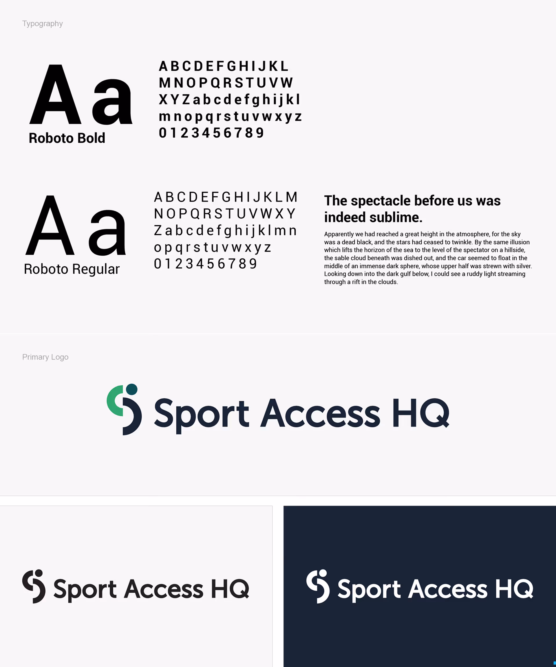
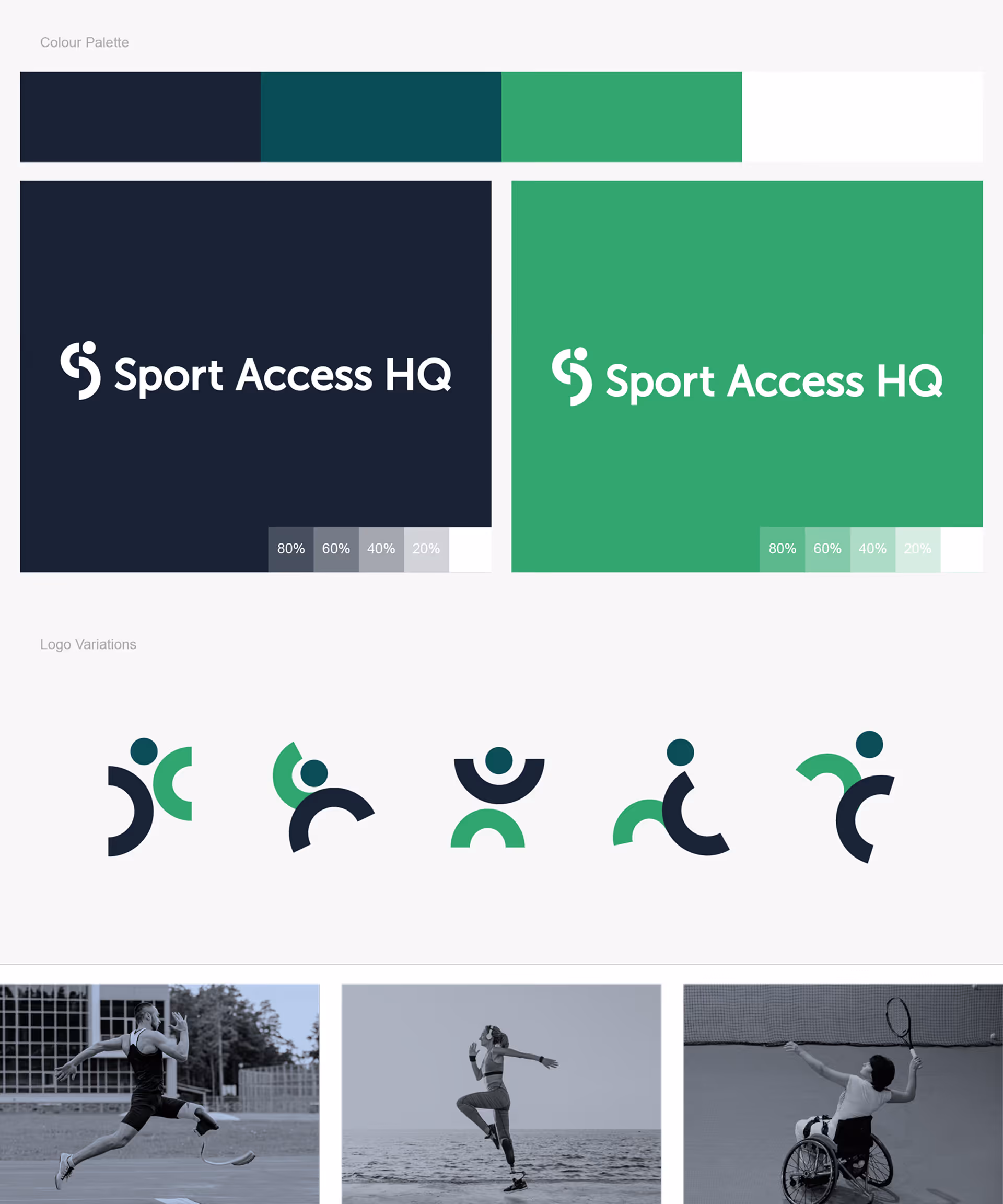
The colour palette balances trust (blues and greens) with innovation (subtle vibrant accents) while maintaining visual alignment with ISD's existing branding. Typography is clean and modern, reflecting SAHQ's tech-driven nature. The logo incorporates abstract elements representing collaboration and accessibility, designed for high legibility across both digital interfaces and printed materials. The result is a brand that clearly belongs to the ISD family while standing confidently on its own.
We delivered a comprehensive brand system that guides future design decisions across SAHQ's app interface, marketing materials, and any future product expansion. The guidelines ensure consistency across digital and print touch points while giving the team enough flexibility to apply the brand without needing to come back to LimeHub for every decision.
A brand for Sport Access HQ that stands independently while remaining connected to the Inclusive Sport Design parent brand
A visual identity that communicates software credibility to facility managers and mission alignment to inclusion advocates
Guidelines designed for the app, marketing, partnerships, and future product expansion
The brand identity positions Sport Access HQ as a credible technology platform with genuine purpose behind it. For sporting clubs evaluating the tool, the brand signals professionalism and ease of use. For peak bodies and inclusion advocates, it signals alignment with values they care about. That dual credibility is what makes the brand work, and what makes adoption possible across an audience that spans volunteer club administrators through to national sporting governance.
The brand system built here became the design foundation for the Sport Access HQ platform itself, carried directly into the UI/UX and MVP development that followed.


.avif)

.avif)
.avif)
.avif)

.avif)


.avif)

.avif)

Schedule a discovery call to discuss your current challenges and explore how a strategic approach can drive growth.

