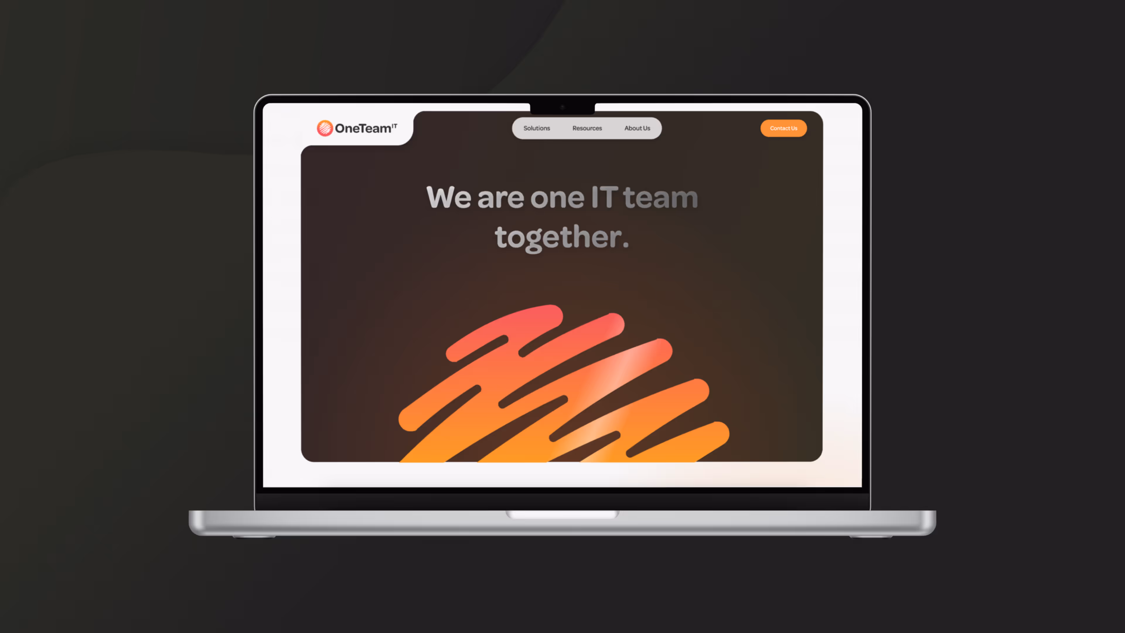
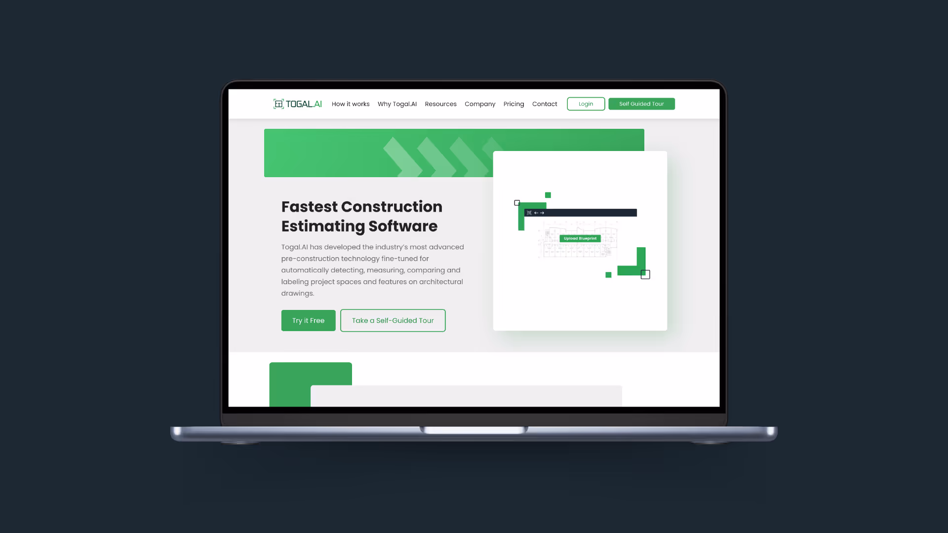
Bold SaaS product identity
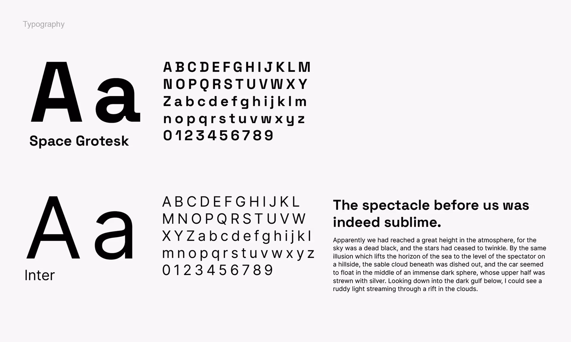
Bespoke typography
Brand identity for market entry
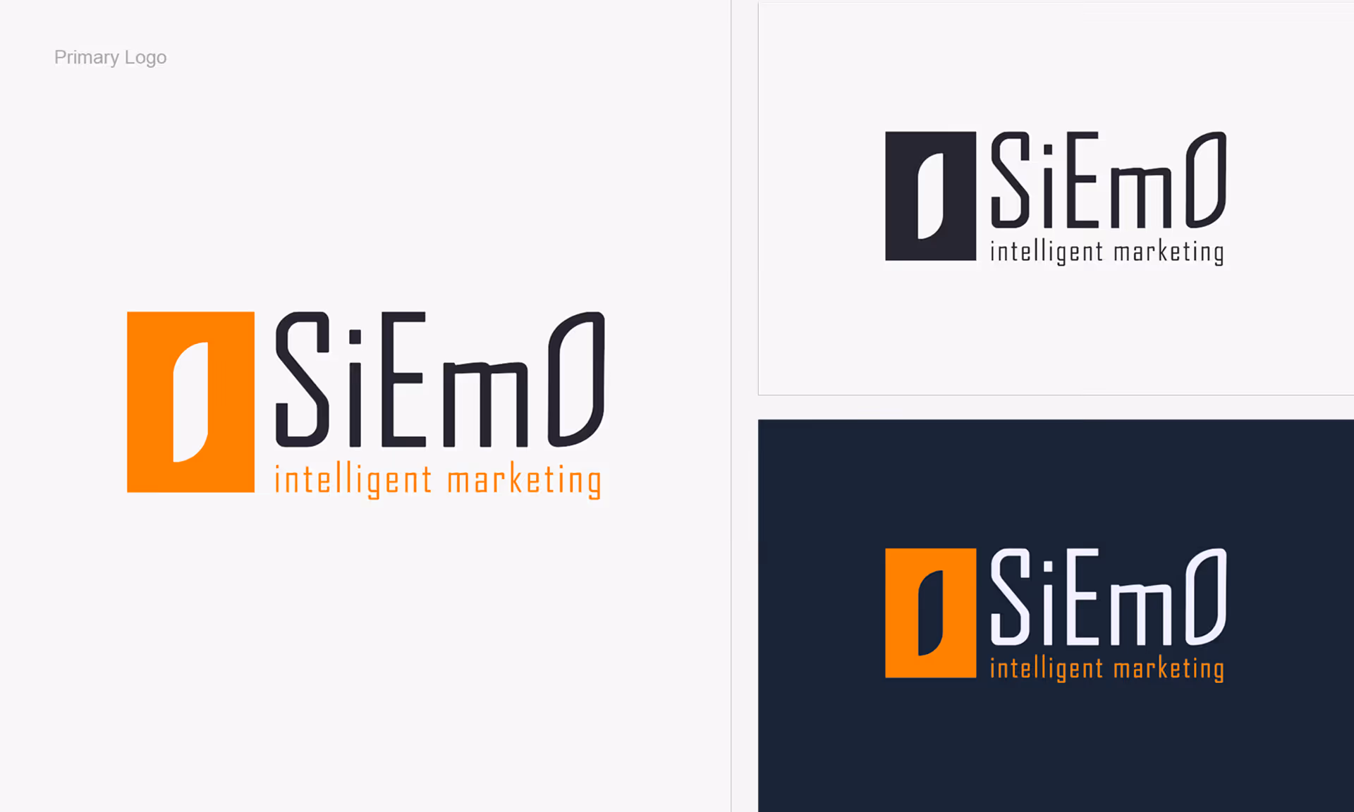
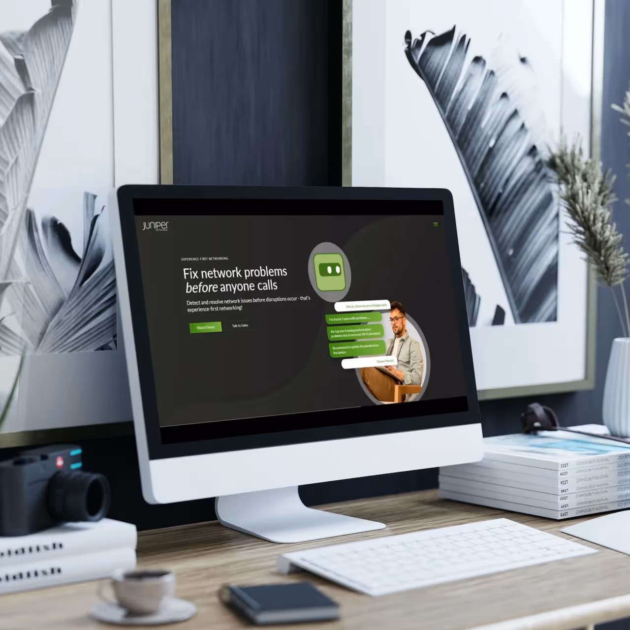
SiEmO is an AI-driven strategic marketing software application designed to help businesses create, execute, and manage marketing strategies. It sits in the gap between marketing automation platforms that track campaigns and the strategic thinking that should inform those campaigns in the first place. The product includes an AI called MarSi that builds custom marketing plans based on decades of marketing expertise.
Like most software startups, SiEmO had been through the cycle of prototyping, pivoting, and iterating. After the initial alpha version of the application was built, the product had real substance behind it. The brand needed to keep pace with the quality of what had been built. For a product entering a competitive SaaS market, the visual identity needed to match the ambition of the product the moment it went to market.
SiEmO needed a brand identity that could stand alongside established marketing technology platforms and signal that this was a serious, innovative product worth evaluating
Most SaaS startups go to market with a product that outpaces their brand. Getting the identity right before launch is one of the highest-leverage decisions a founder can make.
When we worked through the brand discovery process with SiEmO, the positioning became clear. SiEmO doesn't compete on price. It competes on strategic intelligence, the ability to give businesses a thinking layer above the tools they already use. That's a Creator archetype: a brand built on originality, innovation, and the conviction that doing things differently produces better outcomes.
The Creator archetype is one of the harder brand positions to execute visually. It demands genuine boldness. A safe, corporate identity would undermine the positioning immediately. The design had to feel genuinely distinctive, different enough from the sea of blues and greys that dominate the martech space to signal that SiEmO is a different kind of product.
The Creator archetype doesn't allow for safe design choices. Every visual decision had to be bold enough to match a brand that positions itself as the thinking layer above commoditised marketing tools.
The Creator archetype demands innovation and originality. It doesn't default to safe, corporate visual language. Every design decision was measured against that standard: does this feel bold enough for a brand that refuses to compete on price and positions itself as the thinking layer above commoditised marketing tools? That question shaped every choice from typography through to colour.
Rather than selecting an off-the-shelf typeface, we chose a font and edited it to create a custom typographic design unique to SiEmO. This gave the brand a visual signature that couldn't be replicated by a competitor using the same font library. Typography became the anchor of the identity system, the element that would make SiEmO instantly recognisable across every touchpoint.
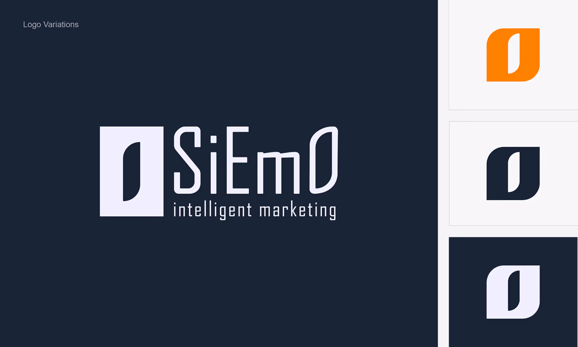
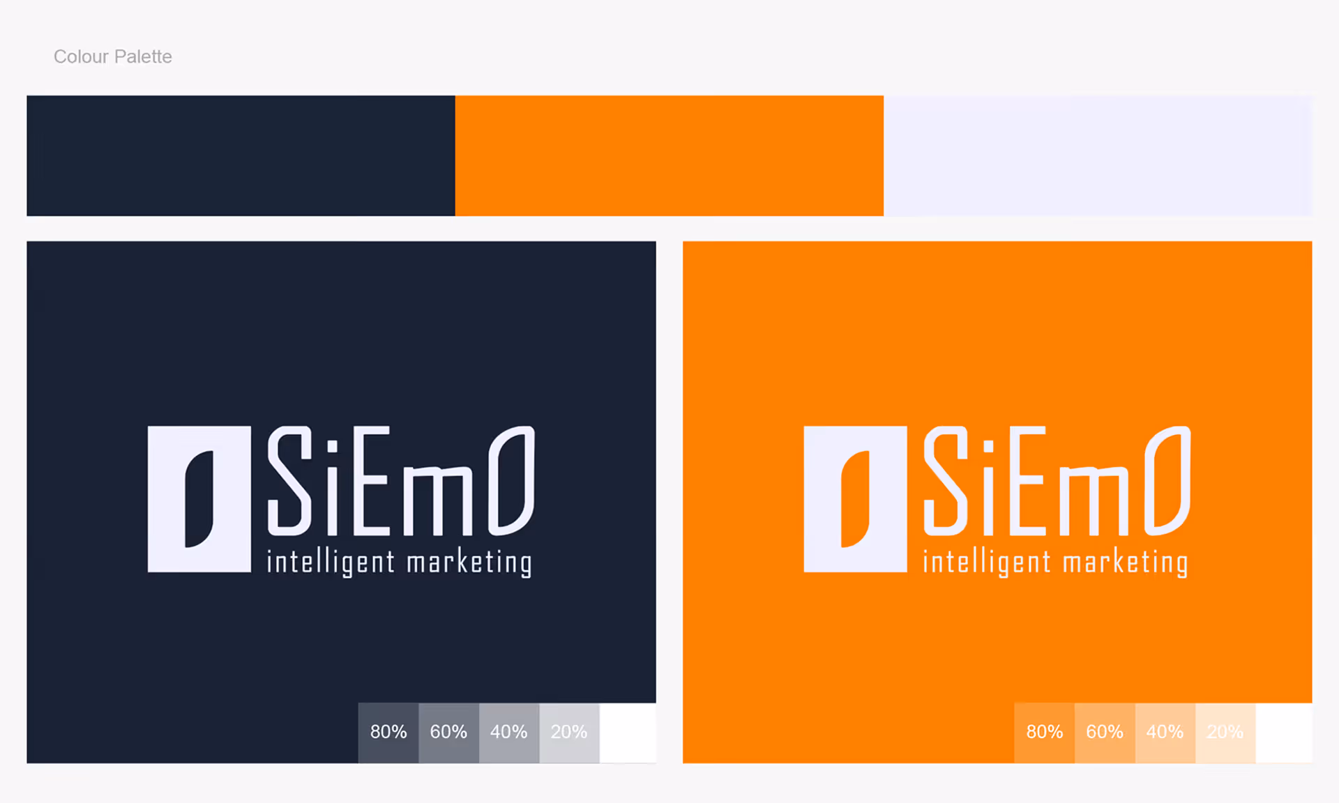
We selected bold, contrasting colours that are deliberately uncommon in the marketing technology space. The palette was designed to stand out in a market where most competitors default to safe blues and greys. The result is a brand that is immediately recognisable and unapologetically distinctive, exactly what a Creator archetype demands.
A visual identity built around the Creator archetype: innovative, distinctive, and designed to stand out in a crowded martech landscape
A custom-edited typeface giving SiEmO a visual identity that can't be replicated from a font library
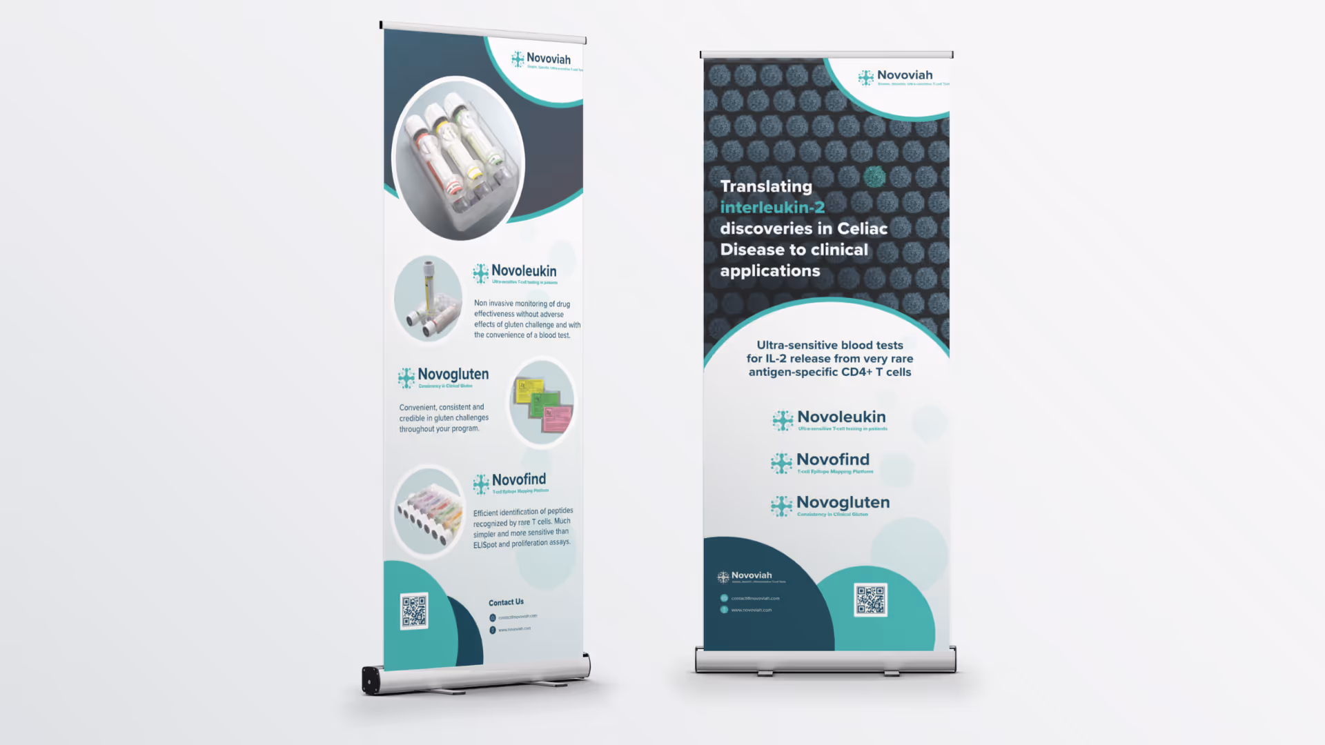
Market-entry brand system
A complete visual identity ready to support product launch, marketing collateral, and investor-facing materials


.avif)
.avif)
.avif)
.avif)

.avif)

.avif)

.avif)

Schedule a discovery call to discuss your current challenges and explore how a strategic approach can drive growth.

