


Impact Leaders provides eLearning course management, course design, and sub-licensing services to businesses across multiple sectors. At the time of the engagement, the eLearning market was growing at 200% per year, accelerated further by the shift to remote work. In a space filling quickly with competitors, a distinctive and credible brand was becoming a genuine commercial priority.
The brief was a logo refresh and brand identity that positioned Impact Leaders clearly: not a large corporate eLearning provider, and not a solo freelancer. Something in the space between the two professional enough to be taken seriously by industry leaders and HR decision-makers, personal enough to reflect the advisory and partnership role the founder plays with every client. The brief called specifically for a logo that was recognisable yet friendly, communicating trust, professionalism, and creativity in equal measure.
A practical requirement shaped the brief from the outset. The platform hosts client courses under Impact Leaders branding, which meant the identity needed to work in digital environments at every scale. from a tiny platform favicon to a full header lockup.
An eLearning platform selling partnership needs a brand that signals trust before the conversation starts.
The discovery workshop mapped four distinct audience groups: small to medium industry leaders seeking professional training solutions, individual consultants in inclusion and wellbeing using the platform to build and distribute their expertise, non-profits without budget to develop their own eLearning infrastructure, and employees of businesses accessing courses purchased by their employers.
What connected all four was the role the founder played. He was not just supplying software, he was consulting, advising, designing, and hosting. His personal involvement was a genuine differentiator in a market where most alternatives were either expensive enterprise platforms or fully self-serve tools with no support. The brand had to carry that, without making the platform feel like a one-person operation.
The logo review in the workshop also surfaced specific digital requirements: a recognisable icon-only mark for platform and app contexts, a clean header lockup, and a favicon that held the brand identity at very small sizes. The i and l of Impact Leaders needed to do real work across all of them.
The brand had to represent a platform that could serve multiple sectors without being sector-specific, and a founder who was central to the product without making the platform feel like a personal project.
The discovery session established the brand position clearly: halfway between a boutique agency and a large corporate eLearning provider. The keyword framework developed in the workshop; optimistic, innovative, positive, trustworthy, growth-focused, transformational. These values grounded every visual decision that followed and informed the entire brief.
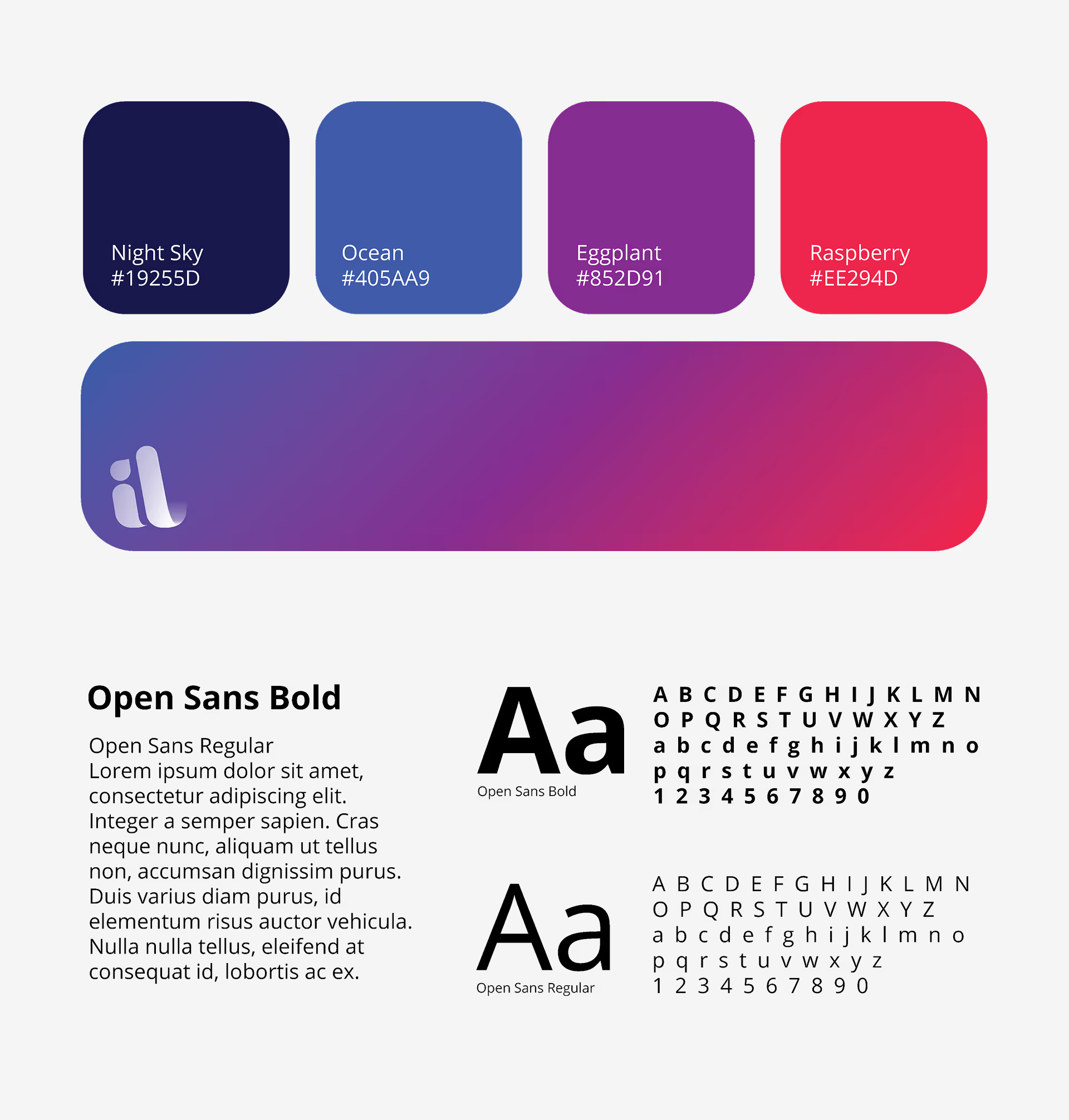
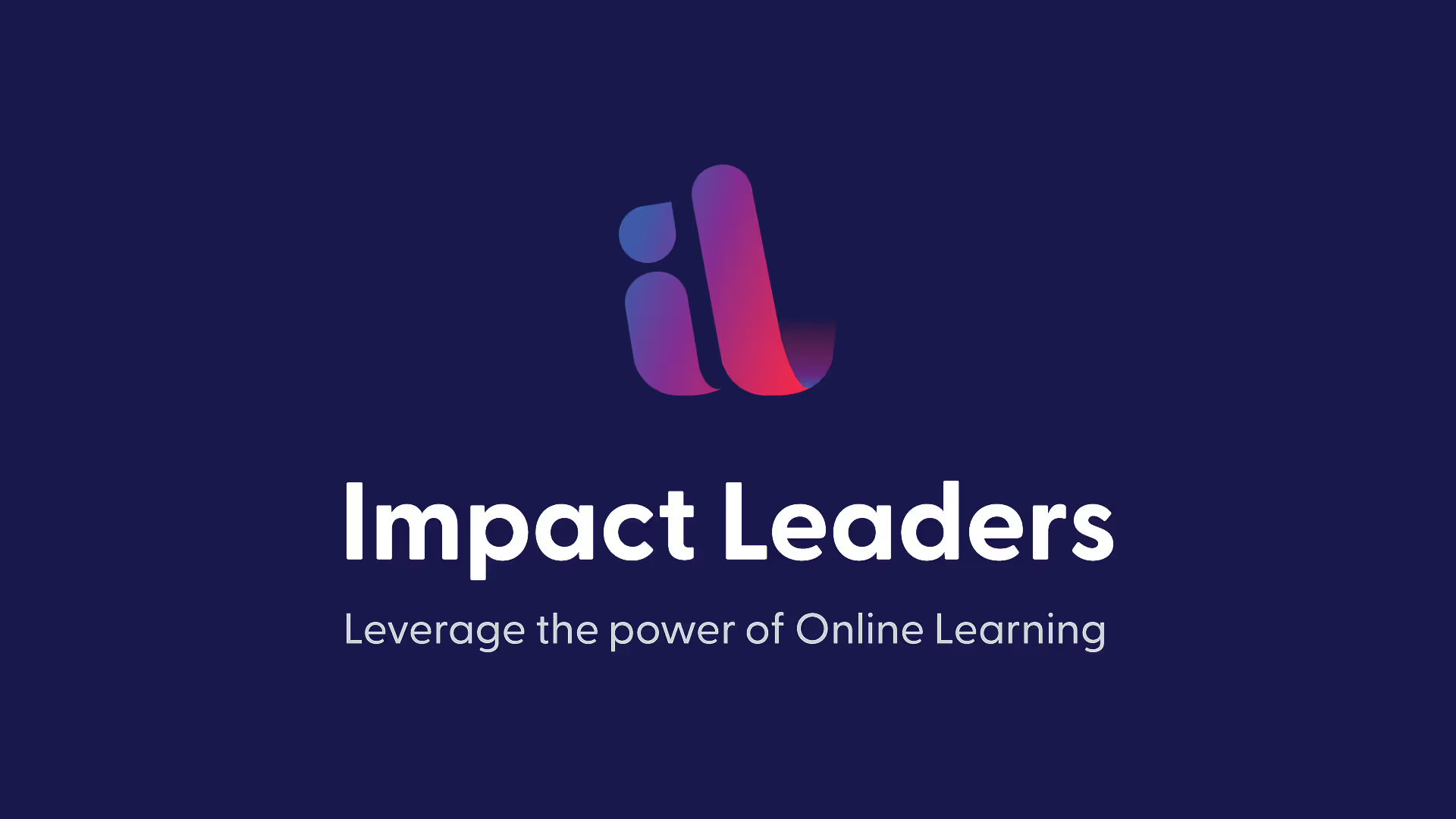
The custom il lettermark uses the i and l of Impact Leaders as the primary visual element. The letterforms are rounded and modern, with a distinctive sweep in the l that gives the mark personality without sacrificing legibility. A gradient runs through the entire mark from deep blue and indigo at the top, through violet and magenta, to coral and red at the base. Vibrant, energetic, and built for digital-first contexts. The mark was designed to work independently as a platform icon and favicon, as part of a horizontal lockup with the wordmark and tagline, and as a stacked hero treatment on the navy brand background.
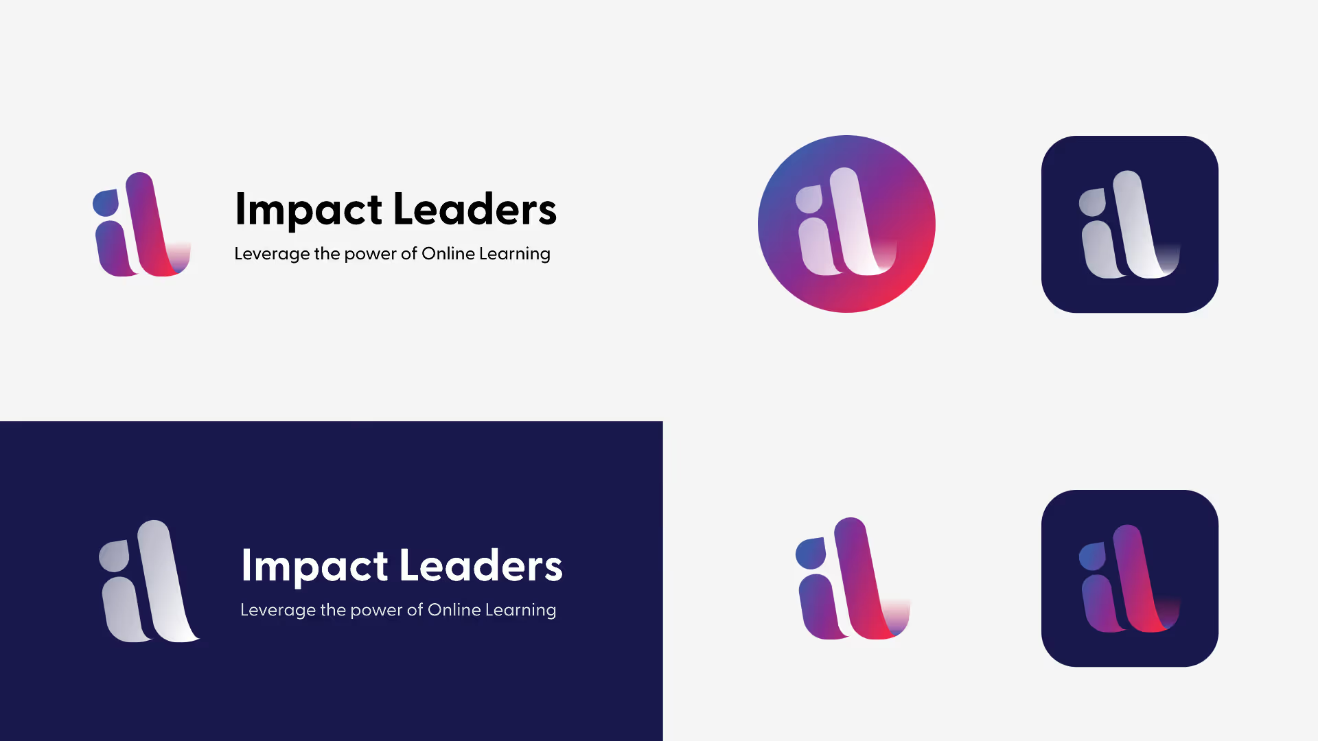
Impact Leaders hosts client courses on its platform under its own branding, which means the identity needed to sit alongside a wide range of client visual styles without clashing. Deep navy as the primary brand environment provides a consistent, authoritative backdrop that makes the gradient logomark pop while keeping the overall experience calm and professional. Open Sans Bold and Regular were selected for their readability across digital interfaces and their neutrality, a typeface that supports the brand without drawing attention away from the content it frames. Multiple icon formats were delivered as standard: circular app icon, rounded square app icon, horizontal lockup, and stacked lockup.
A bespoke logomark built around the i and l of Impact Leaders, designed to be instantly recognisable at every scale
Industry leaders, consultants, non-profits, and corporate employees served by a single identity that belongs to none of them specifically
Circle icon, rounded square icon, horizontal and stacked lockups delivered for immediate use across the platform
The brand gives Impact Leaders a foundation to grow from one that can serve multiple sectors without being defined by any one of them, and that carries the founder's personal involvement without making the platform feel dependent on a single person. In a market growing rapidly and attracting new competitors, that clarity of positioning is genuinely valuable. The gradient logomark is immediately recognisable at every size, and the navy brand environment gives it the authority that enterprise buyers expect without the coldness that pushes community-focused clients away.




.avif)



Schedule a discovery call to discuss your current challenges and explore how a strategic approach can drive growth.




